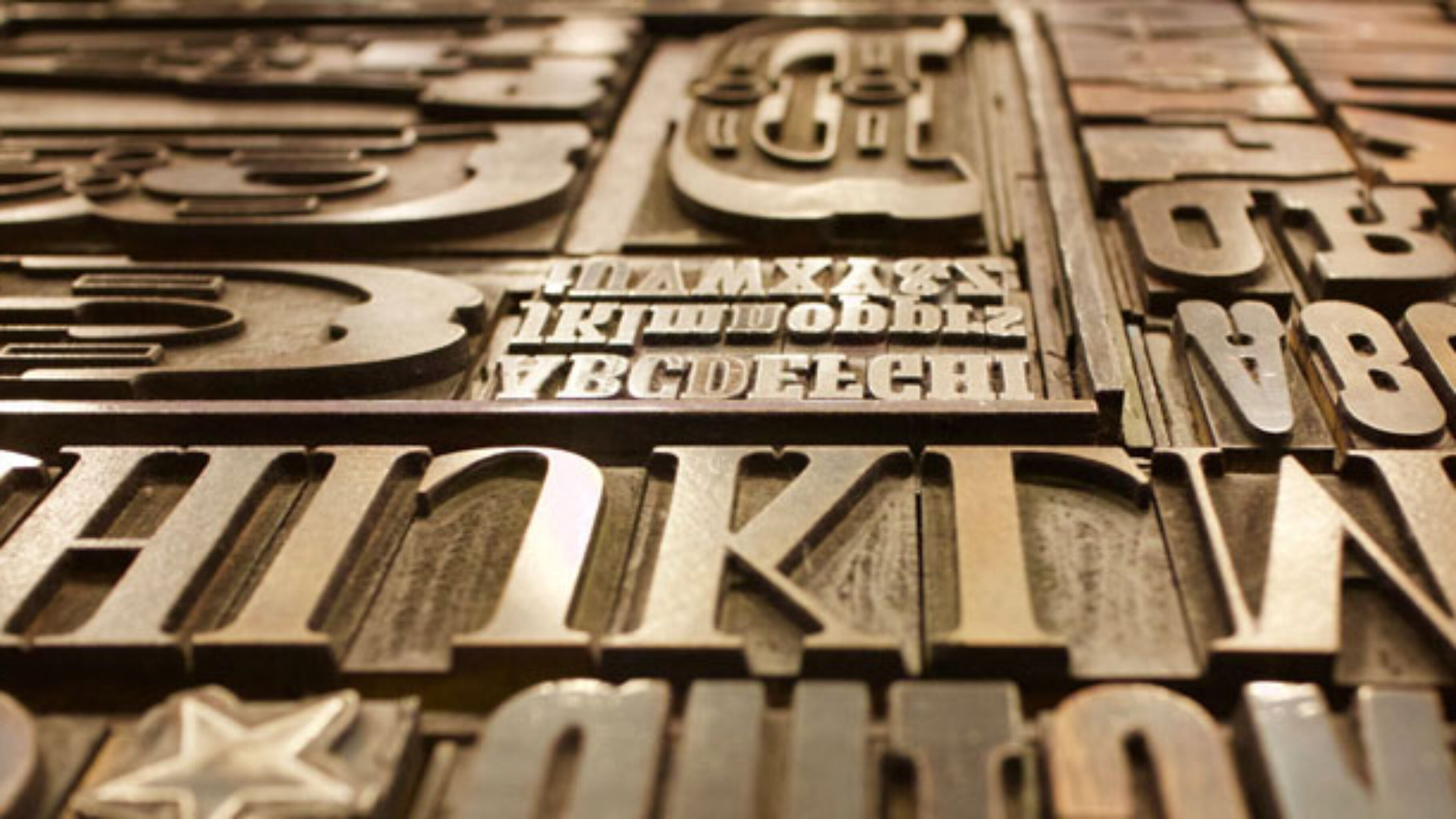
In the ongoing quest to increase eCommerce sales, one powerful design element vital to the visual and functional appeal of an eCommerce store, is typography. Typography is a way of arranging type in order to make the language that it forms appealing and able to facilitate the readers understanding of the text. Type can be arranged in a number of different ways including through font selection, font size and font colour. It can also include manipulating the space between groups of letters and adjusting the space between pairs of letters. Typography when carried out effectively can hold your site visitor’s attention, giving you time to really showcase the products that you’re selling. Good typography creates an emotional connection with your customers – but only if you really understand who they are and what will appeal to them. Fonts have added meaning that will be interpreted by site users. You need to make sure that the effect you create with your use of font and the meaning or mood implied by the typeface, is consistent with the values attached to your brand that you want to convey. If these things are in place, then you stand in good stead to increase your sales. Let’s take a look at some of the other ways you can use typography to boost your sales.
Fonts
Fonts are neither good nor bad. It is all about the context within which they are used. Getting back to the point that we touched upon earlier, it is so important that the mood implied by your font is consistent with what the words mean and what values you want to portray. For example, off-beat, funky font styles should be avoided if the product you are selling is practical or formal and if your brand is therefor trying to portray itself as serious and up-market. Selling high-end cigars and smoking jackets with the use of a funky informal body text, is highly ineffective. It creates a discord between the meaning of the text and the image implied through its style. Users will take one look at the image projected through playful fonts and presume they are in the wrong place and leave your site, thus ruining your chances of making a sale. Using too many fonts can be disorientating. As a general rule it is good to use two fonts on each page, one for display (headings, CTAs etc) and one for body text. A slight contrast between the two is useful in keeping readers engaged.
Colour
Font colour helps determine which things people look at on your site and in which order. Colour determines how a consumers eyes will move across the screen. For example, cooler colours can fade into the background on sites and warmer ones stand out more often than not. It is extremely important that when you select the text colour for your call to action buttons that you use a colour that is attractive to users on both a conscious and unconscious level. This will increase click rates and facilitate the user journey, pushing users towards the all-important purchasing stages. It is a myth that red, a colour associated with danger and alarm, dissuades individuals from engaging when it forms the colour scheme of commands or instructions. Hubspot performed an experiment using green and red CTA buttons. Despite the fact that we commonly associate red with danger and stop lights, the red buttons outperformed the green ones by 21%.
Size matters.
The default size at which your text is displayed is also important. As a general rule, a minimum of 14pt body text, is usually suitable for a laptop or tablet screens. For mobile screen widths, it’s often a good idea to increase this slightly in your responsive website design. It is crucial that you don’t display your text too small and inhibit your site visitors from being able to digest the information on screen. If text is difficult to read, users will quite quickly leave your site, increasing your bounce rate and bringing you no closer to better conversions. The font on call-to-action buttons should be bold and resolute to encourage visitors to take the desired action.
Line length and spacing
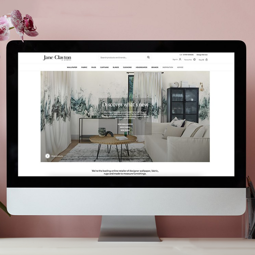
It is important to keep your text brief and your line length short. Visitors will lose interest if lines are too long. It is highly recommended that you keep line length at 60 characters, this includes spaces. Whitespace is also useful in ensuring that your site maintains a user friendly flow to it. It helps you to declutter and decluttered pages on your website will convert better.
Conclusion
The power of typography cannot be underestimated. In the world of digital design, typography is one of the pivotal elements which can have a positive or negative effect on conversation rates and the revenue your site generates. Keeping it simple will cement your branding, attract new visitors and entice customers to keep revisiting your site; thus laying the foundation for increased sales. Effective eCommerce web solutions involve the smooth marriage of many different factors. A/B testing is crucial if you want to determine which approach is best for you. This is certainly true of typography.
