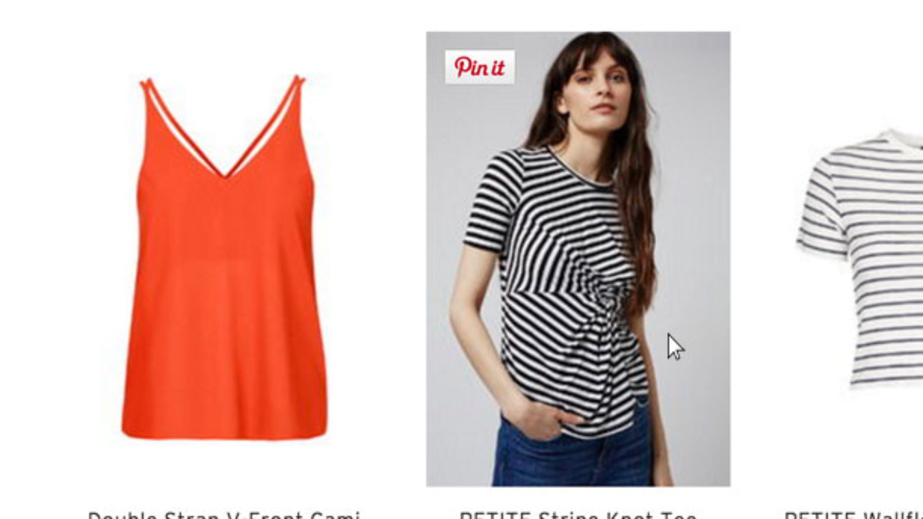
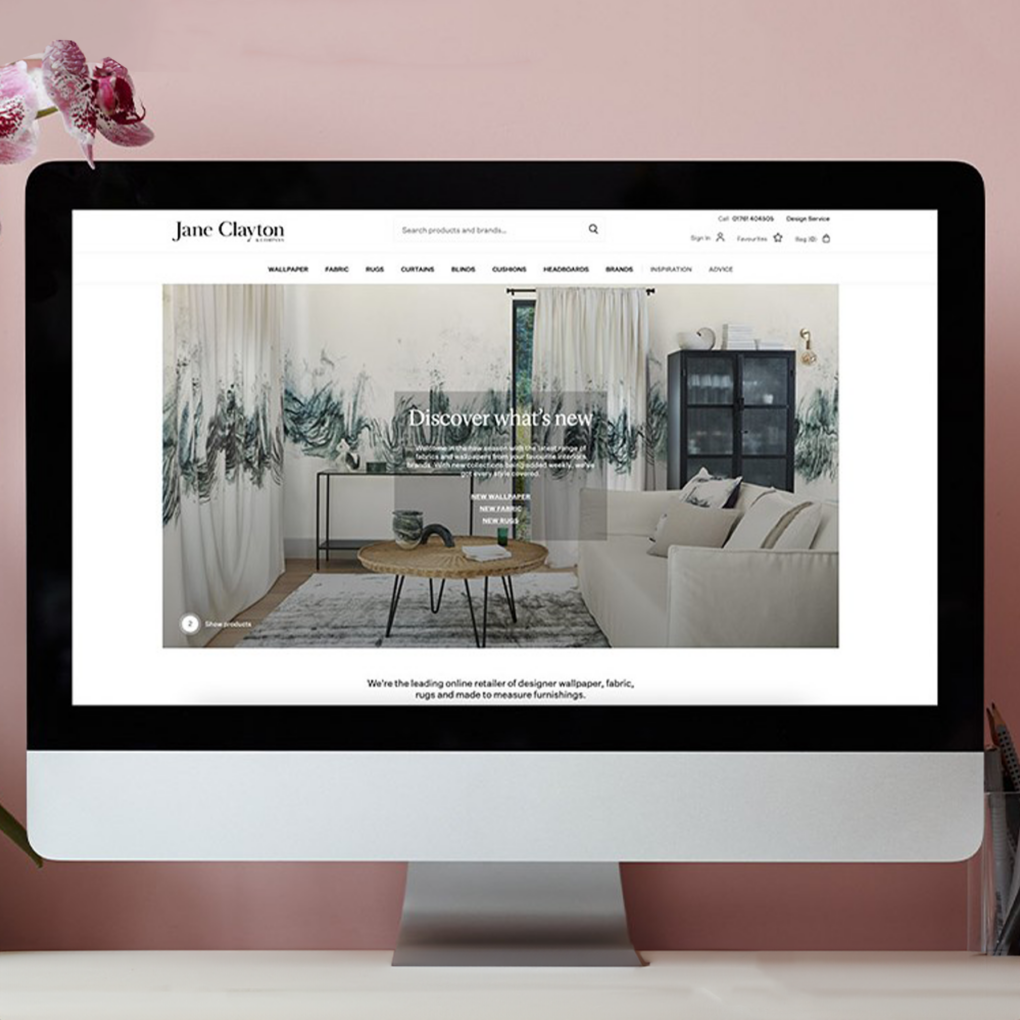
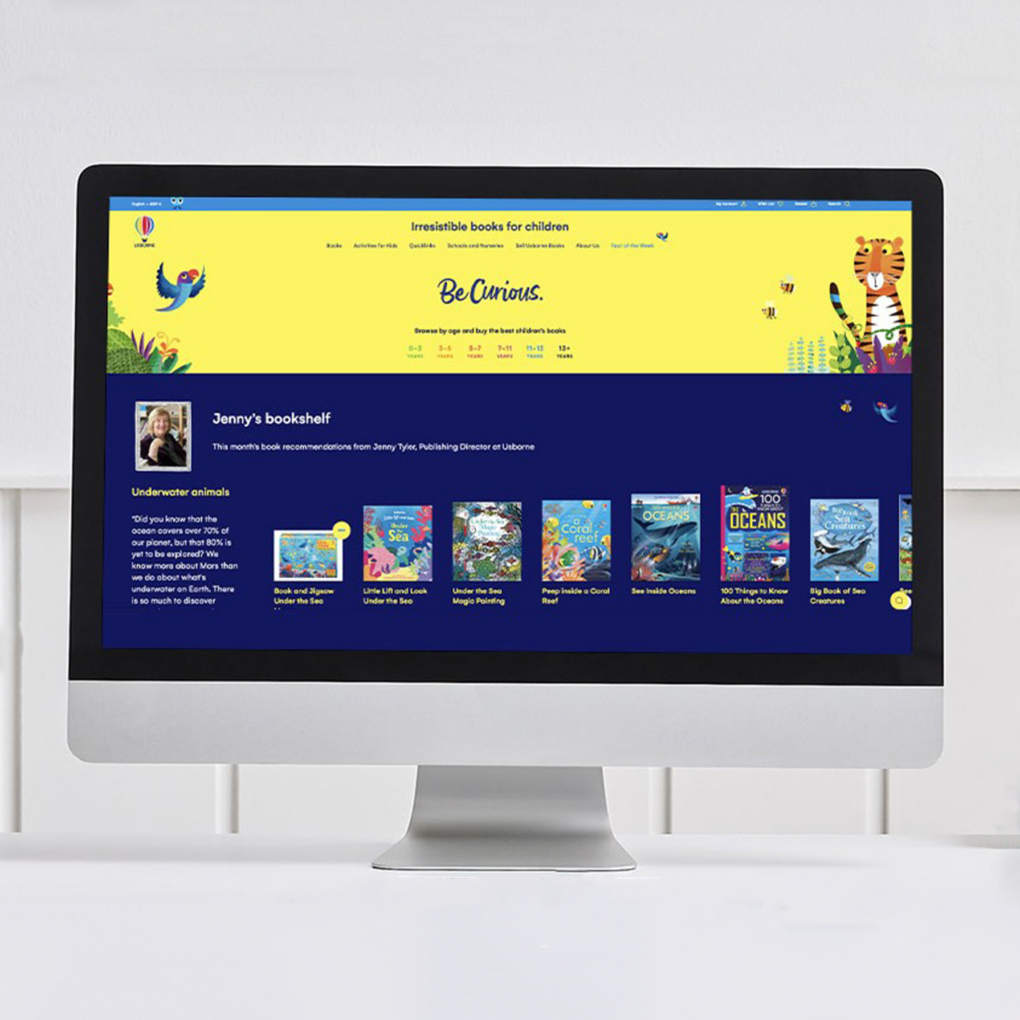
Hover states are a great addition to any eCommerce site. These intricate and clever design functions eradicate the need for excess scrolling. Creative hover states help the user to determine which parts of a site layout are clickable. Although only intended for desktop, they allow designers to maximise space and provide a way of further engaging consumers. They are incredibly on-trend and many top eCommerce websites are using them to exude youthfulness and a contemporary feel. Let’s take a look at how some of the slickest, most successful eCommerce sites are using hover states to increase traffic and boost sales.
American Apparel.
American Apparel are a brand famous for their fresh, hipster street style. They have used hover states on their site to create a futuristic, edgy feel. They have created illusion blocks which disappear when you hover on them and reemerge when you click on them. For example, a block containing a model wearing a particular garment vanishes from the screen when hovered on, leaving just the the call to action displayed, urging the user to click through to the product page. This is a smart way of channeling traffic towards product pages. Another great use of hover states on the American Apparel site is the colour selection option on garments such as hoodies and sweatshirts. Many of the American Apparel clothes, particularly basic items such as hoodies and T-shirts, come in one unisex standard version but are available in many different colours. A great way to showcase all the colours on offer is to display the standard garment next to a colour chart that changes the garments colour when the user hovers their mouse over a colour. This is exactly how American apparel have chosen to showcase their standard garments in different shades and tones. The end result is user friendly and serves to maximise all the space available on the one product page.
ASOS
ASOS, like American Apparel, are keen to appear as vibrant and as exuberant as the millennial consumers they are trying to engage. They successfully exude this image by use of hover states on much of their homepage. For example, in order to highlight male and female clothing sections they highlight the words Men and Women with purple boarders that crackle when the user hovers over them.
There is even a little plane that flies across the screen in fluorescent green. Although this is a scrolling element as opposed to a hover state it compliments the use of hover states well and serves to further create an engaging and exciting homepage.
Elsewhere on the Men’s category page, content blocks are highlighted with a border that appears when hovered on.
Reebok
Often eCommerce sites with multiple header menus can be cumbersome as content appears too frequently and serves to disorientate and distract the user from exploring other areas of the site. Reebok have come up with a solution to excess headers on their site through the creation of a domino fall-out. Meaning that headers appear in flurries when the user hovers on a particular menu. The success of this approach lies in the fact that it mitigates the abrupt nature of drop-down menus that discourage users from exploring sites and moving towards the products they wish to select and purchase.
Hover states are a hugely useful design feature that as we have seen can help eCommerce sites to display their content in a neat and user friendly format. They are great for reducing clutter and encouraging user interactions which result in consumers staying on your site longer and exploring products in more detail, increasing the likelihood of sales.
