Each brand has the goal of creating a unique style. The e-commerce market is overpopulated, and brands need to stand from the crowd, especially the online one. It is by being different than their own identity stayed in the public’s mind. Even for very well established brands, renewing and repositioning their aesthetic – without throwing away its core values – is essential to survive and be relevant.
A brand’s web presence must be consistent and never stray too far from its ethos. The website of any brand must be presented in a way that it is recognisable from other media. For smaller brands, the web presence is their only media outlet. Paying careful attention to the web design is even more crucial. From haute couture brands to high street fashion labels, they all have one thing in common: they need to be trendy in an increasingly competitive environment.
Single page design
A single page or pageless design -as it’s called- is the trend to follow in 2019. The title says it all: It refers to websites that have only one page instead of multiple service pages. From a traditional SEO standpoint, it seems a mistake (especially for ranking pages and keywords), but search engines are favouring these websites.
Why?
By having less of everything (HTML, CSS, Javascript, images), they aren’t bogging the site down with data to be downloaded, making it a better experience for the user and granting priority in the search engines. Being weightless and minimal is also great from an aesthetic point of view. This type of design looks good on every browsing device and automatically fall into being mobile-friendly. But, the best part is they also tend to have high conversion rates. With single page sites, everything drives the user toward a conversion point.
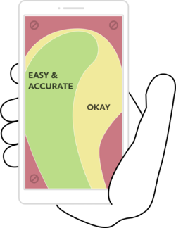
Thumb-friendly navigation
This theory is not new, but the thumb-friendly navigation is still trendy in 2019, especially with the increase on mobile users. By 2020, more than 2 billion people around the world will own a smartphone, and the thumb is the king when it comes to mobile browsing. Josh Clark in his book Designing for Touch, investigated how users hold their mobile phones and how their movements, particularly those of the thumb, should be acknowledged in the web design process.
Video backgrounds
In the opposite corner of pageless design, we have the video background. This trend is still incredibly popular and has been shown to increase conversions. Not only video posts are prioritised on social media but are also an excellent tool to introduce your brand. Users are more likely to stay on your website to watch the whole video. By staying longer, your time on site metric raises, and the higher your average time, the better is your SEO. Research by Foodbloggerpro showed that their conversion rate increased 138% by using video background on their landing page.
Micro-interactions
When a visitor takes a small action on a website or an app, and there is a specific response to it (a sound, a notification, an animation), these are micro-interactions, and 2019 is expected to be the year when these responses, inspired by gamification, take the lead role on every website.
Diversity
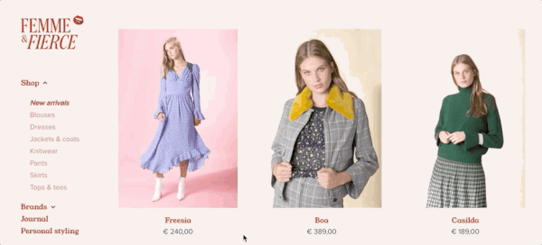
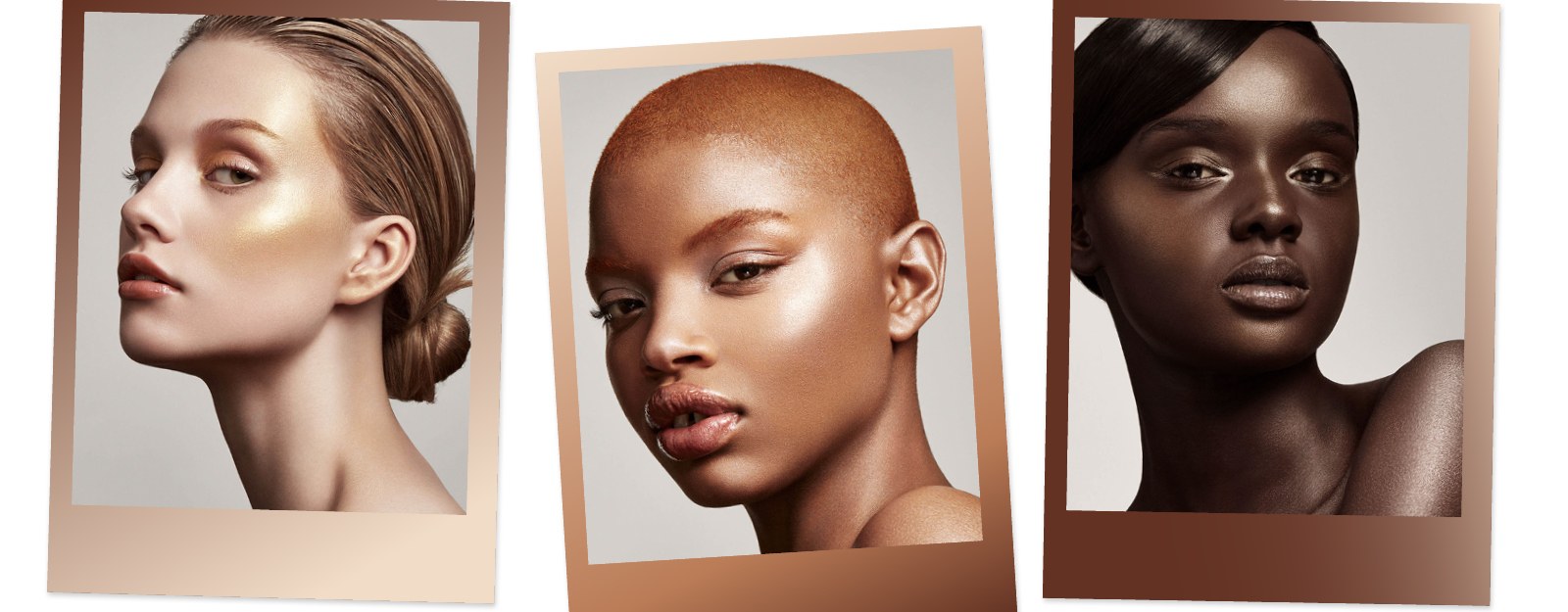
Don’t forget an essential aspect of your website: the people. Successful customer experience includes being able to connect with your audience. In 2019, the users want to see themselves reflected in the content rather than grinning stock photo models. This year, inclusiveness, accessibility and diverse imagery are the paths to follow.
According to a recent article on Diversity published by Forbes “Fenty Beauty, a cosmetic company created by singer Rihanna, earned $100 million in sales in their first 40 days of business. Customers raved about their 40 different shades of foundation, designed for customers across the spectrum including individuals who have albinism”.

