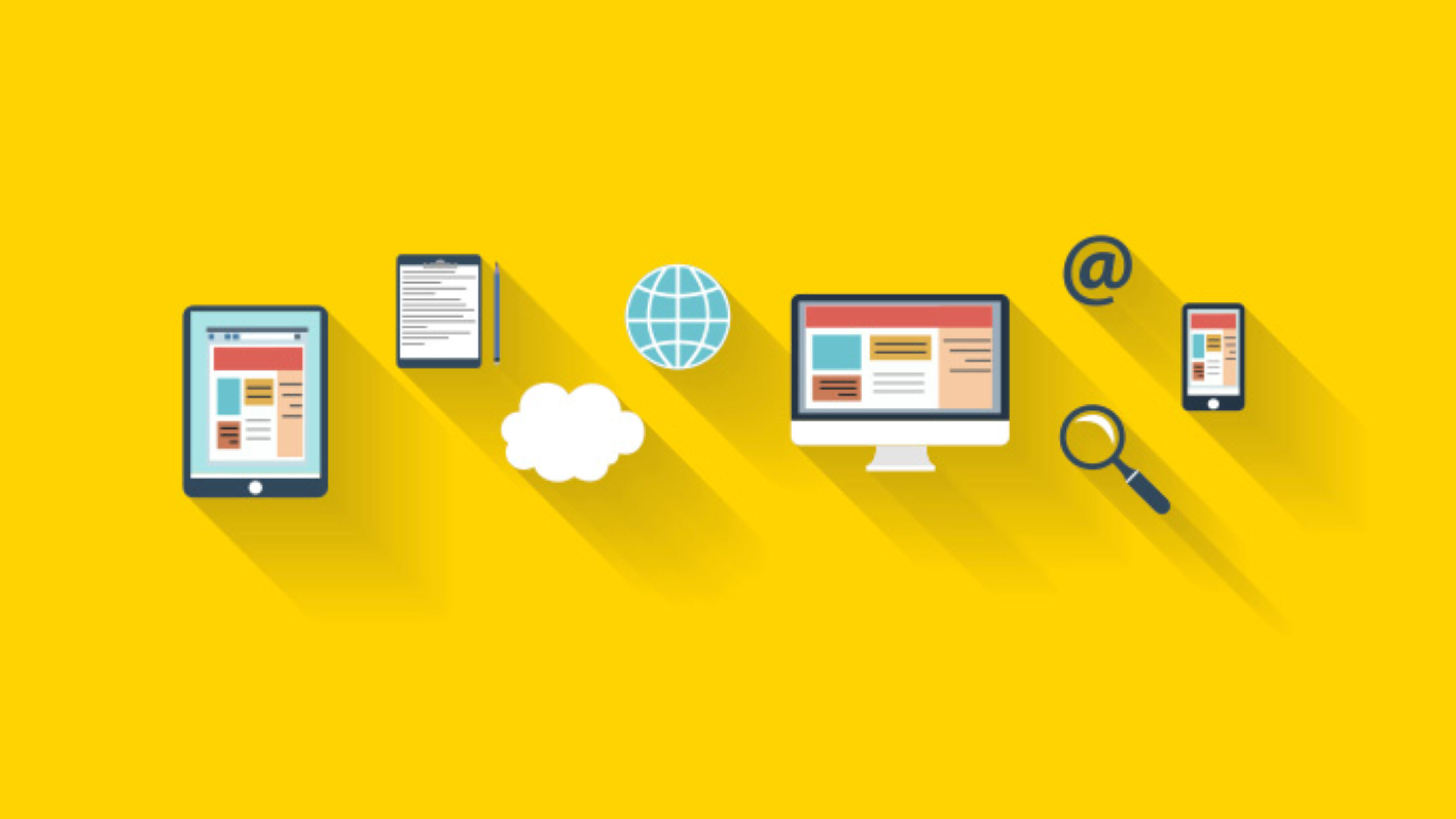
In recent months flat design has taken off as one of the key players in E-commerce design. Pioneered in part by Windows 8, the company which abandoned 3D semi realism in favour of sharp clean tiles in 2012, flat design since 2013 has been embraced by Apple.
So what is flat design? Why the sudden shift toward this style of website design?
Flat design is an approach based on the philosophy that simplicity is key. The matter of fact, mimicry of real objects or things is entirely absent from this model of design. Whereas realism favoured life like representations, like the News stand app in 2012 iPhones, which resembled a rickety magazine rack, flat design goes for functionality focusing on strong colours, and interesting fonts.
It was initially believed to be true that users would only enjoy interacting with the digital world, if it was littered with items, graphics and images, which were as similar to their real world counter parts as possible. Hyper realistic design was thought to elicit trust in the user and therefor encourage as much interactivity with the site as possible.
Flat design, completely shunned this way of thinking in favour of quicker responsiveness. It sought to use only those elements necessary to convey the page or applications message. It believed that there were more simplistic and concise ways to convey a site, object or graphics message.
There are many straight forward advantages of flat design, which have allowed certain websites to become market leaders in their fields, through early adaptation of the design approach.
The main advantages are that it often leads to simple user interfaces that are relatively easy to make responsive. Its modest use of graphic sizes tends to produce smaller files and there for faster loading pages. This can be a decisive reason why some sites become more favourable than others. Users crave a quick efficient loading website and this may be the sole reason they chose between one site over another with almost similar themes and content.
Also, with quicker page loading times, your site becomes more user-friendly and accessible which will ultimately improve it’s SEO.
Another key reason for the fast adoption of flat design is it’s overall compatibility with mobile devices. With mobile devices becoming ever more popular as our means of browsing the internet, there is a growing need for desktop sites to utilise responsive design. Flat tile shaped sections on a site are much more adaptable and easier to shrink down and rearrange when viewing on different screen sizes. Although, flat design has broad appeal, as it does work equally well on desktop sites. It is a trend that is very much in favour in the current digital climate, but is ultimately subject to the same threats of change and replacement as any other digital trend which attributes it’s status to the technological belief frameworks of the moment.


