Since the start of the pandemic, eCommerce has moved forward ten years in the last 12 months. Some businesses have struggled to make the switch to online, but the reality is that consumer’s shopping behaviours have changed. In fact, over a third of people in the UK buy online multiple times a week.
If you want to retain and grow your customers online, you need to meet them with a dynamic eCommerce website. Competition is also a growing threat as brand saturation within the market is increasing daily.
This is why we recommend you keep up with the latest eCommerce web design trends in 2021. Let’s get right into it.
Interactive design
According to Ideamotive, 80% of people remember things that stand out. With so much saturation within the online retail industry, you want to make sure your website is one of those things your customers will remember.
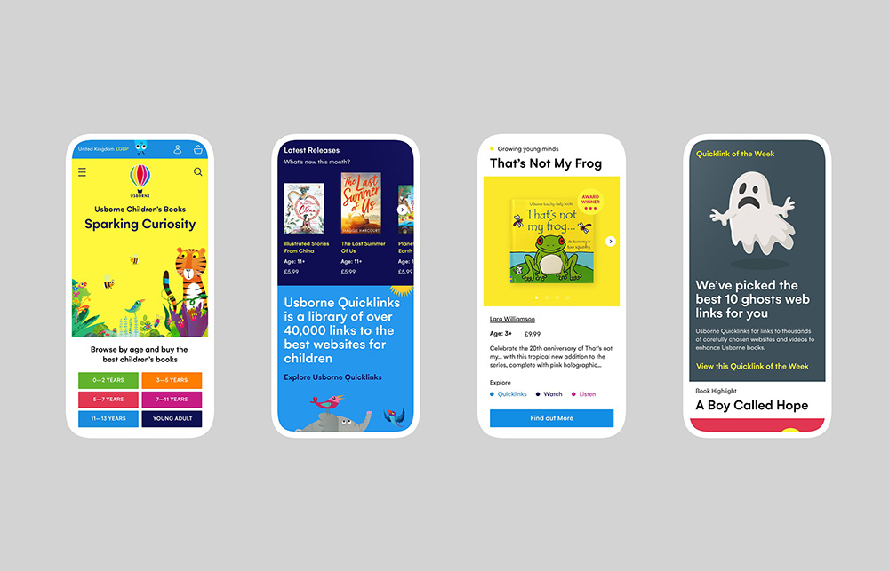
UK’s leading children’s book publisher Usborne recently went through a digital transformation, including improving its eCommerce website UX/UI. The result is a fully interactive and seamless shopping experience for their customers. The homepage alone immediately draws your attention as it comes alive with a web design featuring bright colours and illustrations following Usborne books style.
As you scroll down, interactive panels featuring book recommendations, along with new releases, greet the customer. It’s a fully immersive experience that brings joy and invites you to keep browsing to discover more surprises.
“Since the launch in November 2020, the site’s engagement is solid, sessions are up 145%, and there has been a 20% reduction in bounce rate. The e-commerce conversion rate has increased by 128%, through a 460% increase in transactions and combined with an improved AOV, a 692% revenue increase”.
Read more about this case study on our profile on The Drum, where Anna Howorth, Director of Global Branding and UK Marketing at Usborne, shares the company’s experience working with Superb on this exciting project.
Personalisation
Personalisation has become the marketing buzzword of 2021. Over 77% of consumers turn to brands that offer product personalisation. There are many ways in which you can offer personalisation on your website, ranging from personalised landing pages and website content to relevant product recommendations.
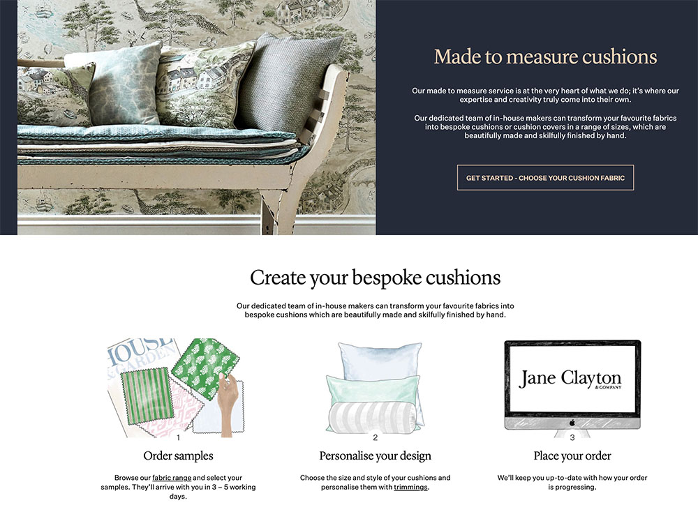
Jane Clayton, a leading UK interior design brand, also went through a web design enhancement. The UX/UI has been improved to provide a more seamless experience, especially for its “made to measure” service. This is a very prominent section on their homepage, allowing the customer to discover this unique service quickly.
Customers can design one of a kind bespoke curtains, blinds, cushions or headboard. You can choose from different fabrics, colours, patterns and sizes. The brand also offers you a personalised fabric sample delivered straight to your door. Once the customer is happy with the results, they can place their order online.
Our eCommerce and web design team are skilled and motivated professionals who deliver a beautifully designed and seamless site for every client. You can view more of our work on our website, and contact us at any time.
Dark mode
Dark mode has recently become popular, especially with Apple device users. Working from home has also led to blurring lines between work and leisure. As a result, people are spending more time on average in front of screens than before the pandemic.
This is why dark mode has become a top trend for website design in recent times. The dark mode is easy-on-the-eye and also makes your website look minimalist and chic. While allowing other brighter colours to pop out, this is great, especially if you want to pull the user’s eye to a specific section on your landing or home page.
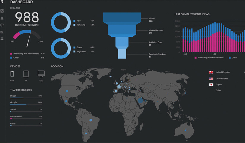
Recommend, the personalisation and 360º marketing platform for e-commerce businesses have updated its brand and website and the UX/UI of the platform itself. Featuring a more minimal and modern style, the e-commerce solution chose a black and white palette for a more clean approach, including the solution’s interface. One of its more significant improvements is the possibility of using the platform on dark mode –a feature usually saved for websites and mobile apps only, making Recommend stand out from its competitors.
Shoppable content
Since the launch of shoppable Instagram posts in 2017, social commerce has taken over the world of online shopping. For example, Natori, a luxury clothing retailer, has increased its overall revenue by 100% since they started selling using Instagram Checkout.
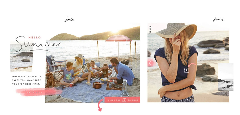
There is a huge ROI potential from shoppable images, and nothing is stopping you from implementing this shoppable feature on your website. The British clothing brand Joules has done this well so far by launching a series of shoppable lookbooks, incorporated with tiny shopping tag markers on critical images.
Shoppable content is a great way to stand out from the crowd and make the consumer’s shopping journey a little more unique.
Web design colour scheme
According to research done on the “Impact of Colour on Marketing,” it takes 90 seconds to form an opinion about a website or app, and 90% of this opinion depends on the colour scheme used.
Colour and branding are the backbones of a great eCommerce website. With the web design, there are two routes you can take, the more minimal cheek look or, the more bright, colourful website.
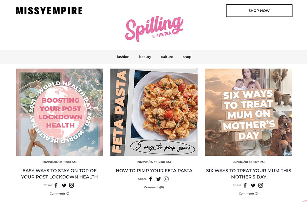
For example, British fast-fashion clothing retailer Missy Empire follows their branding and colour scheme down to a “T”. Their recognisable baby pink colour flows throughout every page. Their branding is Instagram inspired, with the blog section mimicking the tile layout. Contrasting imagery is used throughout the site also.
In 2020 revenue for Q4 for Missy Empire was recorded at £12.46 million. You can find more information about our work with Missy Empire on our website. You can also contact us today to discuss how we can help you build a successful eCommerce website.
Overall…
If you were a business that previously only focused on their in-store sales, it’s time to upgrade to online, better late than ever! But this is a critical strategy we recommend for all retailers to get ahead of the competition and give the customer purchasing options.
The five tips we shared above are simple yet effective ways to complete beautifully designed and functional websites for our clients. As designers and creatives, we try to break through the mould and challenge the past’s web design traditions. We love working with great brands, and we have the track record to prove it. Don’t pass up on the opportunity to differentiate your brand from your competitors.

